Tag: WOW Design

  • Wow, exclaim kids at Hershey’s product

    Wow, exclaim kids at Hershey’s product

    MUMBAI: Wow Design, a strategic brand design consultancy, has associated with Hershey’s for strategising the packaging design for its new range of healthy flavored milkshakes.

    Evolving Indian consumers prefer richer, superior experiences when it comes to food and beverages as they are exposed to it on global excursions. The health foods category in India too is slowly evolving to meet with the consumers preferences.

    Wow Design is a strong believer in creating elegant and impactful packaging, as it’s the face of any brand and allows an interaction of only a few minutes with the consumers before they make up their mind.

    For Hershey’s product launch, Wow Design evaluated both – the current brand drivers and the challenges in launching a product that would appeal to both the buyer (mothers) and the consumer (Kids). These drivers were – existing equity with the consumers in delivering rich experience on taste, flavor and mouth feel and an aspirational imagery attached to the brand. The challenge was to find a fine balance between delight for kids and healthy goodness for mothers in a pack of milkshake while exhibited on the same shelf as its Indian competitors.

    A thoughtful decision was taken to leverage on the richness and consistency of the product to establish it as a milkshake versus the available flavored milk products. The designs stemmed from the core concept of it being the ultimate healthy milkshake that kids deserve.

    The final result was clean, yet communicative range of packs that retained the global appeal of the brand Hershey’s and connected effectively with the health-conscious Indian consumers.

    Wow Design partner and executive director Deepti Kshirsagar said, “The design strategy needs to work for the dual target audience – one the consumer and second the decision maker. Coming from an aspirational yet familiar international brand like Hershey’s, the trust aspect for the mothers and tastefulness for the kids could be taken care of with a prominent brand endorsement in the design. The challenge was to imbibe the healthy goodness of the product, as that becomes a primary concern for the mothers and impact decision making to a large extent. ”

    Wow Design partner and executive director Saswata Das said, “The rapid growth of the flavored milk beverages category in India has attracted many global players like Danone and even Coca-Cola to enter this segment. We helped Hersheys’s to take on the Indian players and charge a premium for their unique positioning and fortification benefit.”

  • WOW Design rebrands Complan

    WOW Design rebrands Complan

    MUMBAI: In today’s competitive world, brands need to re-invent themselves time and again.

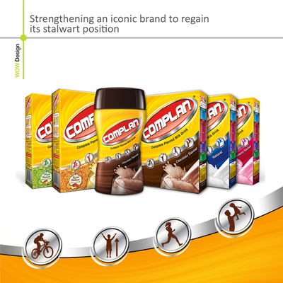
    Complan which is a known name in the health drinks category on its golden jubilee has decided to do the same. As the brand widens its offering to the entire family – “Taakat Ka Naya Plan – Naya Complan”, it has now got a new look with its new positioning.

    After a multi-agency pitch, WOW Design, a brand design consultancy, recently gave a new look to Complan. The challenge in front of the consultancy was to communicate the brand’s reposition through an apt look for the new Complan. The key thought for them was to ensure that “Strength for the whole family” is the promise of new Complan.

    WOW Design endeavoured to ensure that the new brand identity took into consideration every aspect of the new positioning and communicated it upfront. Beginning from the logo unit, which is a compact bold unit using a strong red that spells power and strength and strong yellow background. The background colour is a very essential part, making it ownable to the brand, a part of the identity. The yellow colour stands for happiness, intellect and energy, hence ideal to be associated with the new positioning of Complan i.e. Overall Strength. Even the font used for the new brand logo is a closely bound unit, chosen specifically to depict ‘strength’. The power action emanating from the logo itself, saying that “Complan gives you the strength to do multi-tasking, successfully in your day-to-day life.”

    The brand identity also features mnemonics that depict everyday activities that children and adults engage in, conveying the 4A advantages, the brand delivers. These units created specifically as a part of the identity that can be carried across media, to emphasise on the advantages in every communication.

    The drool factor ideally infused through the food shot, has also been reworked to depict not just the tempt value but also the strength (remaining true to the brand promise). Even the cup being replaced with a glass, in line with the wider target audience.

    The key reason to believe the new Complan promise i.e. ’34 Vital Nutrients’, interestingly re-created and connected with the ingredients, for the consumer to know ‘what are the 34 nutrients’. Each of them being segregated to convey which of the ingredients deliver each of the 4As (advantages) respectively.

    The 4As – Appearance, Activity, Armour and Alertness. This particular aspect of the brand has also been communicated in an interesting manner.  A wholesome circular unit on the back of pack, specifying the 4As details:

    • Appearance – Physical Stature,
    • Activity – Strength to cope with life,
    • Armour – Immunity,
    • Alertness – Brain Development & Cognition

    The exceptional effort of connecting every element with “overall strength” was to ensure that there is no doubt in the mind of the consumer with respect to the brand promise.

    WOW Design ensures that the new look delivered to the new Complan, had to be maintained across the entire range, considering the multiple variants in the Complan family. Hence the brand architecture strictly rigid in the top half with the logo unit, background and the brand 4As mnemonics and the bottom being used for the variants.

    In case of the variants each of the variant has been given its individual personality, which comes across prominently. It was also a task to give a more premium and rich look to the ‘Kesar Badam’ and ‘Pista Badam’ variants, in view of these being the high end variants in the family with rich ingredients