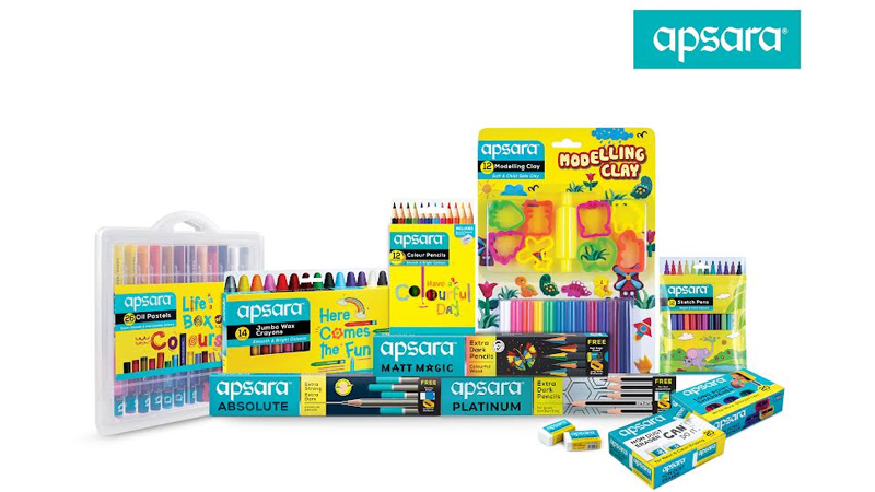
Mumbai: Apsara, the flagship brand of Hindustan Pencils, has launched its new brand identity and packaging design. This transformation aims to redefine Apsara’s market presence with a fresh look that reflects the brand’s commitment to quality and innovation.
Since its inception in the 1960s, Apsara has become a well-known name in stationery, elevating the simple pencil into a symbol of excellence. Through campaigns like “Extra Marks for Good Handwriting,” Apsara has set standards for students and professionals alike. Today, Apsara continues to innovate, demonstrating the impact of a well-designed product.
Apsara has consistently updated its logo and packaging to maintain relevance. The latest rebranding modernises the typeface while preserving its recognition. This update introduces a unified visual identity across all product lines, including art materials, gifts, and stationery, bringing consistency to the brand’s overall presentation.
In this revamp, a turquoise shade has been selected as the primary brand color, unifying Apsara’s diverse product range under a single identity. For the pencil and related categories, where Apsara has a strong legacy, subtle adjustments were made to preserve familiar visual elements and the existing color palette. The art materials and gifting segments now feature a bold yellow color scheme, improving shelf visibility and making it easier for customers and retailers to recognise the products.
“Our new packaging is a testament to our dedication to delight consumers with designs that are as exceptional as our products,” stated Hindustan Pencils president Pradip Ughade. “This revamp not only enhances the customer experience but also strengthens Apsara’s market presence across a broader spectrum of products.”
The agency behind the revamp – Almond Branding founder Shashwat Das added, “This transformation solidifies Apsara’s leadership in the market. The refreshed identity resonates with both our loyal customers and new audiences, reinforcing Apsara’s influence in the stationery and art materials markets.”
Apsara continues to set industry benchmarks with its innovative approach and unwavering commitment to quality. The refreshed branding embodies the company’s vision of evolving with market trends while upholding the core values that have defined Apsara for generations.
NEW DELHI: A little more than two years after the Vodafone and Idea merger on 31 August 2018, the brand finally announced a new integrated brand identity for itself on Monday noon. The new brand named ‘Vi’ comes with the promise of “Together For Tomorrow”, ensuring users that the company will play a bigger role in the consumer journeys. In the press interaction, the senior management also indicated that the merger will move ahead with a sharp focus on augmenting digital experiences for the user.
The branding exercise has attracted a lot of attention within the industry and started many discussions across platforms.
Sideways co-founder Abhijit Avasthi pointed out that there was great anticipation surrounding the new brand identity when two of the biggest telecom companies in India merged two years back and this new entity is signalling the beginning of a new journey for them as an integrated entity. It’s a launch of ethos and a new persona.
“I am keen to see how the new company will behave going forward as in their initial avatars, the two were very different companies; one was far modern, contemporary, young and the other one was a little bit more earthy.
Abhijit Avasthi
AVASTHI THINKS IT IS A LAUNCH OF A ETHOS
AND A NEW PERSONA
Almond Branding founder & director Shashwat Das said, “If I come down to the logo for what is the largest telecom integration in the world, I am a tad disappointed. While there has been an attempt to retain the equity of both Vodafone and Idea logos- the red colour and the exclamation respectively, the end outcome could have been a lot more exciting.”The new elements of the brand identity, the logo, the moving lines of the animation, and the bold mustard dot of I, has initiated a series of discussions on various media. But the industry is not mighty impressed with the new design.
He added, “I have already seen people mistaking it for the Roman numeral six and am sure that the circular dot jutting out at the bottom will be making a lot of people uncomfortable. To some it looked like a medal. But I am also a bit concerned about the uncanny chiseling of the V at the base. The way I decode it, the bold mustard dot will be a dynamic element of the identity showcasing the amazing possibilities and also symbolizing focus – bringing back the focus on the consumer. So while the concept is good, the execution leaves us wanting for more.”
Shashwat Das
DAS IS DISAPPOINTED WITH THE NEW LOGO
Elephant co-founder, director Ashwini Deshpande said that it is a bit premature to respond to a logo when one hasn't seen the visual language or communication around it but it doesn’t look like a mobile first logo that the company might want it to be. She quipped that the finesse that Vodafone was famous for, in its language and script, is missing in the new brand identity.
“In the absence of a full picture, it reminds one of solid logos from the industrial era except the falling yellow penny that is out of scheme for those times. It doesn't look like a 'mobile first' logo. Also wondering how the app icon will pan out since the yellow penny will reduce the size of V & I in the app icon enclosure. Considering the exposure & choices of Gen Z & millennials, it is a bit disappointing. It neither conveys communication nor technology,” she elaborated.
Ashwini Deshpande
DESHPANDE IS ALSO DISAPPOINTED AS THE NEW LOGO
NEITHER CONVEYS COMMUNICATION NOR TECHNOLOGY
Deshpande further commented, “This would have been the perfect time to liberate the visual identity from the regimented colour scheme borrowed from previous identities of Vodafone and Idea. But the design has stuck to predictable red & yellow. Looking at how the Jio logo has several colour versions (even Docomo did this earlier and Go Air too) that still look ownable due to the font and container, V! (Vi) seems to have passed that opportunity.”
Das disagreed a little from Deshpande as he pointed out, “The digital-age modern identities have to be dynamic, flexible and fluid. I am sure that the new Vi identity will live upto it. I visited the new website and it did look fresh and elegant. The design is indeed minimalistic and the identity is fluid enough to transform itself into various forms and environments. The mustard dot can be seen everywhere from radio-buttons to the chatbot animations. So I believe the dynamism and fresh look can help hook the attention of the young consumers.”
He added, “I also like the tagline “Together for Tomorrow” which captures both the aspects of the two companies coming together for a brighter tomorrow as well as WE (the company and the consumer) are in this together to build a better tomorrow. There is a lot of power in the inclusiveness and collaborative feel of Vi (read We). Hence the brand storyline has immense potential.”