Tag: Redington

  • Lexar snaps up No.1 spot in India’s camera memory card market

    Lexar snaps up No.1 spot in India’s camera memory card market

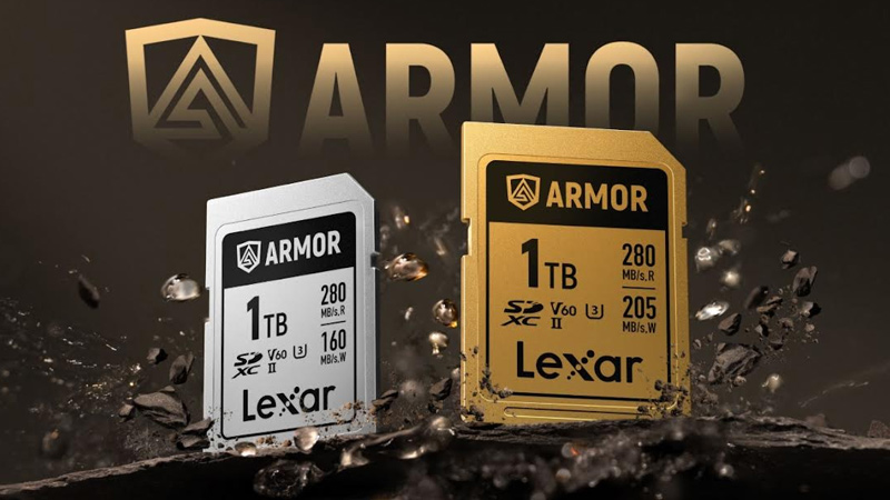
    MUMBAI: Lexar zooms into top frame with India’s No.1 camera card crown. If memory serves you right make it Lexar. The global memory and storage brand has just captured the No.1 position in India’s camera memory card market, according to the latest CMR Consumer Storage Flash Devices Report (Q1 CY2025).

    The numbers speak volumes: Lexar holds a whopping 69 per cent share in the high-performance CFexpress category and 36 per cent market share by value in SD cards, making it the overall leader in the segment. Cfexpress cards, known for lightning-fast speeds, are the go-to choice for professionals working with 4K and 8K content and Lexar seems to have won the confidence of India’s digital creators by a landslide.

    “Securing the No.1 position in India’s camera memory card market is a significant milestone,” said Lexar general manager of India Middle East and Africa Fissal Oubida. “This latest CMR report is a testament to our focused strategy, product innovation, and growing trust among professionals and enthusiasts alike.”

    Lexar’s rise has been powered by a portfolio that ticks all the right boxes: breakneck read/write speeds, rugged reliability, and storage options that range from compact gigabytes to hefty terabytes. Whether it’s a wedding in the monsoon or wildlife in the Thar, Lexar’s weather-sealed, shockproof cards are built to take the shot and survive it.

    The company’s professional-grade offerings include Cfexpress, SDXC, microSD, card readers, and portable SSDs, all geared toward creators who need storage that keeps up with their vision.

    Lexar’s Indian distribution muscle via Redington Ltd., Creative Newtech Ltd., and Supertron Electronics Pvt Ltd has also helped the brand stay close to the country’s fast-expanding imaging and content creation ecosystem.

    As digital storytelling and creator-led content continue to boom in India, Lexar’s ability to blend speed, safety, and scale has positioned it as a brand not just capturing data but capturing the moment.

  • Redington unveils new global brand identity

    Redington unveils new global brand identity

    MUMBAI: Redington, the $6 billion distribution and supply chain giant for international brands in the IT and mobility sectors, has unveiled its new global brand identity with a new logo and tagline – Seamless Partnerships. 

    The new brand identity reflects the core values of Redington as a contemporary and innovative company, which has developed its messaging strategy to reflect its evolution as a brand and its global role as one of the largest providers in the supply chain solution industry. The new logo and tagline epitomises the new direction that the company would like to take in the years to come.

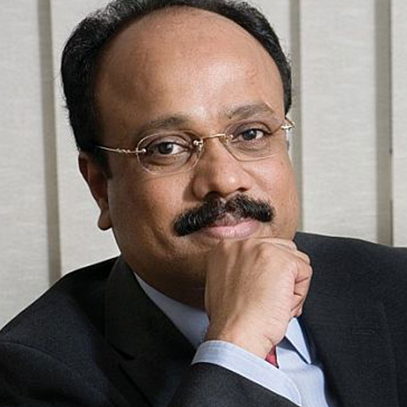
    Unveiling the impressive new logo and tagline, Redington managing director Raj Shankar says, “I am proud to launch today our rejuvenated brand and visual identity that fully reflects what we stand for as an organisation. This is not a mere change of brand identity but a coming of age for Redington, a transformation that the company is engineering to take it to the next level. The new identity carries forward our core values on which our company is built – adaptability, collaboration, know-how, objectivity, simplicity, transparency and trust. We look to expand our horizons from being a ‘brand behind brands’ to a platform that enables seamless partnerships. Redington is committed to do everything to achieve its ultimate goal of being the preferred company for connecting buyers and sellers. Re-emphasising the word ‘preferred’ as in a competitive world, Redington wants to build and grow lasting partnerships.”

    The new logo of Redington symbolises synergy – while the existing colour green has been retained, different shades have been introduced as well, keeping in mind the ever-expanding portfolio and services of the company. It represents the synergy and oneness that Redington possesses as an organisation – be it with vendors, customers, team, the environment, technology and the ecosystem within its circle of influence. The latticed geometric design depicts technological innovation as well as simplicity in complexity. The symmetrical form shows harmony between Redington and the other organisations that it collaborates. The energy is depicted in the reverse white lines, also representing the common thread of Redington’s philosophy and spirit running through the organisation towards a common good.

    As a heritage brand, Redington is stepping into its 25th year and the new branding builds on its well-established reputation in the industry.

    Established in Chennai in the year 1993, Redington is a well-known global brand having its operations across India, South Asia, Middle East, Turkey and Africa. With a strong network of 37,500 partners, Redington distributes more than 200 brands across 24 markets and has leadership position in most markets and brands.

    Redington, which has a strong distribution base, prides on the trust that it enjoys among not only its customers but also the vendors whose brands it distributes. Some of Redington’s brand and vendor relationships have been existent for decades.