Tag: rebranding

  • Vodafone Idea Ltd rebrands itself as ‘Vi’

    Vodafone Idea Ltd rebrands itself as ‘Vi’

    NEW DELHI: Going ‘Together for Tomorrow’, Vodafone and Idea have been rebranded with a unified identity ‘Vi.’ The integration of two brands is a culmination of the largest telecom integration in the world. The announcement was made Monday noon via a virtual press conference. 

    Vi is built to be strong, ever-dependable, agile, intuitive, and a brand in tune with the needs of the customers, in these ever-changing times. It is future-ready and is committed to dynamically serve and enable a digital society. 

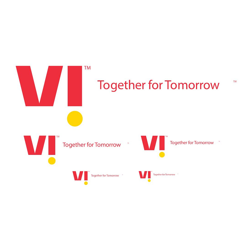
    The new brand identity has been designed in collaboration with Vodafone Idea Ltd’s agency Ogilvy. 

    Vodafone Idea Ltd MD and CEO Ravinder Takkar said, “Vodafone Idea came together as a merged entity two years ago. We have, since then focuesed on integrating two large networks, our people and processes. And today I am delighted to present Vi, a brand that will bring important meaning to lives of our customers. Indians are optimistic and want to get ahead in life. They would love a credible partner to help them on this journey. Vi’s positioning is built around this promise and will focus on meeting the customer needs to help them thrive.”

    “The brand integration not only marks the completion of the largest telecom merger in the world, but also sets us on our future journey to offer world-class digital experiences to 1 billion Indians on our strong 4G network. VIL is now leaner and agile, and the deployment of many principles of 5G architecture has helped us transform into a future-fit, digital network for the changing customer needs. The new brand launch signifies our desire to not just deliver, but delight our customers, stakeholders, communities and our employees and signals our passion and commitment to be a Champion for Digital India. With Vi, we are confident of building a brand that continues to command respect and trust, and will be admired and loved by all. We look forward to your continued support as we get ready to deliver a superior Vi experience,” added Takkar.

    Vodafone chief digital transformation and brand officer Kavita Nair said, “Vi leverages the strength of two of India’s most loved brands, Vodafone and Idea. Vi is vibrant, exciting and throbs with the spirit of rising India. It is committed to help every Indian move ahead in life. Vi is dynamic, flexible, fluid and always on. In the months to come Vi will continuously unpack exciting possibilities for its customers. Vi is built for the new age and for the connected ecosystem. We invite everyone to join this exciting journey as we move towards building a better tomorrow.”

    The team highlighted that the rebranding is not just an identity but a new design system, which intends to leverage legacy and at the same time be transformational in its intent and signals that change. It stretches across consumers and businesses, and across all classes, geographies, urban and rural.

    Nair noted, “The “i” is always punctuated with a bold mustard dot. It is confident, surprising and delightful. It reflects the throbbing and progressive pulse of India. It is unique, continuously unpacking amazing possibilities, and always putting customers at the heart of everything.” 

    Starting today, Vi ads will be on TV and digital platforms, followed by a high decibel intensive multi-media campaign, spread across the physical and virtual channels. The customers will get a personalised message to welcome the new brand identity and little surprises like creating a personalised ringtone from one’s phone number are at offer. 

  • Cadbury Dairy Milk gets major rebranding in 50 years

    Cadbury Dairy Milk gets major rebranding in 50 years

    MUMBAI: Britain-headquartered confectionery giant Cadbury has done its first major rebranding in 50 years for its flagship Cadbury and Dairy Milk bars, reveal several international reports. The packs have been redesigned by Bulletproof agency with a redrawn wordmark, new iconography and typography. 

    The new-look is designed keeping in mind that consumers today are seeking more natural, authentic, and higher quality product offers.

    As per reports, the new pack will be first launched in Australia, hitting the shelves in the next few months, followed by South Africa and Malaysia later in the year. The UK and Ireland will get the new packs by 2021. 

    Nick Rees, Global Creative Director at Bulletproof global creative director Nick Rees has been quoted as saying: “We wanted to recapture the very spirit of Cadbury so part of the research process involved digging into the Cadbury archives to reinterpret its iconic visual cues to create a modern and playful identity that still has a clear recognition for consumers.”

    Cadbury global brand director Ben Wicks commented: “Cadbury Dairy Milk is a true icon both in the UK and worldwide – it’s the nation’s favourite chocolate brand, with a rich heritage and feeling of nostalgia for many consumers. Over the last three years, we have been reconnecting with our roots, which is why the new identity is grounded in the original intent behind the brand and celebrates our unique product credentials and iconic distinctive assets in a modern way”.

    Follow Tellychakkar for the consumer facing news & entertainment

  • Bajaj Almond Drops Hair Oil undergoes first brand makeover in 25 years

    Bajaj Almond Drops Hair Oil undergoes first brand makeover in 25 years

    MUMBAI: Bajaj Corp has unveiled a brand new packaging for its flagship brand, Bajaj Almond Drops Hair Oil.

    For the first time in 25 years, the brand has changed its packaging. The brand’s new look aims at targeting the new age consumers and build on its key imagery attributes of lightness, nourishment and premiumness in an environmentally sustainable manner.

    The brand roped in UK based design agency Pentagram to help design the biggest change in its history. The brand has moved on from its classic colour palate to a premium pearlised maroon and gold combination. The bottle is sleeker and the label takes an almond-like tactile effect.

    With emphasis on the betterment of the environment, the Rs 10 pack, which is a mass rural consumption pack, will be introduced in a recyclable PET jar format. Also, its lead SKUs – 50 ml, 100 ml and 200 ml are sold in environment friendly glass bottles.

    Sandeep Verma Bajaj Corp president sales and marketing says, “As a brand, we have always believed in resonating with our ever-evolving audience. The new packaging is a crucial step for the brand and it signifies our endeavour to reach out to the new age consumers while maintaining our brand philosophy of ‘Load Mat Lo’. Having said this, our emphasis will always continue to be on providing a light, non-sticky almond hair oil.”

    The 360-degree campaign featuring Parineeti Chopra as the brand ambassador of Bajaj Almond Drops is live across TV and digital mediums.

  • Shemaroo revamps logo to suit digital consumer

    Shemaroo revamps logo to suit digital consumer

    MUMBAI: Over the years, Shemaroo has had to reorient its business to suit the changing ecosystem and consumer preference. Now, the content powerhouse has revamped its look as well by unveiling a new logo.

    In its 55 years of journey, Shemaroo has witnessed various changes. 15 years ago, it went through a brand refresh. About 10 months ago, the company announced that it has embarked on a transformation journey.

    Shemaroo gears up for digital era; adds devotional app Ibaadat

    Speaking to Indiantelevision.com, Shemaroo Entertainment CEO Hiren Gada shared the experience. After a three-month selection process, Ogilvy India was approved as the creative partner. “It’s the number one agency in the country. Shemaroo is a brand which has been around for 55 years, has been so closely guarded, so many people have such an emotional connection with the brand. If it has to undergo a refresh, it needs to be with the best,” Gada commented on the reason behind choosing Ogilvy as a partner.

    Initially a B2C brand, over time, its business model has become B2B2C. However, the main target of the refresh is consumers. Gada believes that a strong B2C connection is needed before thinking about how people will perceive the change.

    However, Shemaroo promises to stay loyal to the Indian audience by offering them entertainment with that “special tadka”. ‘India Khush Hua’, the new tagline, wants to convey the message of how the company wants to bring joy to Indians with multi-genre offering.

    Curation brands the need of the hour in digital: Kranti Gada

    The logo comprises a series of overlapping layers in rich Indian colours while the shape of the design elements has been derived from the digital play button. “They are already the modern forward-facing company that the logo reflects,” Ogilvy India CEO Kunal Jeswani said.

    “What I found really interesting was the company has done so much to transform internally before they decided to do the external transformation of the brand. Then the task for us becomes much easier. For agencies, when you are transforming a brand externally, it’s far more difficult when the internal shift is going to happen after that. In the case of Shemaroo, it’s just the colours and logo reflecting the change,” he added sharing his experience working with Shemaroo.

    To devise the new logo, Ogilvy undertook surveys for a thorough understanding of the brand, consumers and the trade through careful planning, exhaustive research and understanding of emergent trends.

    A large part of its multimedia campaign will be through its own media. “There are partner properties which we would be working with. We would also be buying some additional media. But primarily it would be on the digital domain. Because the consumer is largely digital, that’s where more targeted and faster refresh can be achieved,” Gada said.

    The company has the ambition to achieve 5X growth in five years. Multi-genre and multi-language strategies are also on the anvil. Devotional content is a core area for the current time. Through the new identity, the company wants to convey their passionate commitment to the goal.

  • Johnson & Johnson rebrands baby care portfolio

    Johnson & Johnson rebrands baby care portfolio

    MUMBAI: Baby care brand, Johnson & Johnson, has always been under the scanner with people claiming it causes cancer and is actually harmful for a baby’s skin.

    The brand has stuck to using scientific research to back up the global appeal of its products. But that was up until now.

    Today, with rising awareness about artificial fragrances and harmful dyes used in bay care products, brands like Johnson & Johnson, Pampers, Huggies and others are being questioned and asked to move towards an all-natural alternative.

    Now, to address the rising concern of parents and consumers around the globe, Johnson & Johnson has decided to rebrand its entire baby care portfolio prioritising transparency over science as it looks to get closer to parents.

    Since the brand needed a new identity to connect with the millennial consumers/parents, it undertook an intensive research spread over 18 months with mothers and fathers. J&J discovered that the general concern among parents was about the presence of harmful dyes in products and a general need for greater transparency from the brand’s end. 

    The baby care company has completely redesigned its packaging based on the feedback from its customers and employees, with an easy-to-hold, pump action bottles that can be operated with one hand while holding a baby. The products will now display the ingredients that go into their products and fragrances for the first time, which has until now been considered a secret. 

    The global relaunch will roll out over the next 18 months, starting in the US in August, followed by China and India by the end of this year and then in the UK during quarter one of 2019.

  • Ogilvy rebrands its identity after 70 years

    Ogilvy rebrands its identity after 70 years

    MUMBAI: After 70 years of creating some of the world’s most iconic marketing campaigns, Ogilvy has revamped itself to adopt a new mantra  – ‘Makes Brands Matter’. At the heart of this transformation lies the agency’s desire to introduce a new organisational structure and brand identity. 18 months is what it took Ogilvy to complete the largest transformation in the company’s long and illustrious history.

    So why did the world’s biggest digital agency shake things up? “To meet the changing needs of our clients, we’re taking a bold step to redefine our company and build a new model for our industry, which we helped to create over 70 years ago,” says The Ogilvy Group chief executive John Seifert.

    The objective of redifing the brand is the agency’s response to constant digital disruptions that are impacting consumer behaviour, media landscape and competition. 

    The integrated Ogilvy brand brings together three distinct units of OgilvyOne, Ogilvy and Mather Advertising and Ogilvy Public Relations along with various sub-brands and specialty brands under a single, unified group with a common identity, positioning, client service model and P&L.

    This unified entity (Ogilvy) will have a new organisational design. The transformation from a matrix-managed holding company of sub-brands to one brand represented by twelve crafts and six core capabilities along with a new operating system. Ogilvy will also offer new consulting options.

    Building on the success of OgilvyRED, an enterprise offering called Ogilvy Consulting, focused on the areas of Digital Transformation Consulting, Growth, Business Design and Innovation, will work horizontally across Ogilvy. 

    The network will also launch a new global digital platform called Connect to train the employees  to boost knowledge-sharing, professional development and customised community-networking.

    The Ogilvy Group chief creative officer Tham Khai Meng is clear that the agency will not deviate from the values it was founded on, “Our creativity is the foundation of Ogilvy’s global network and the most powerful competitive advantage that we have. We are building on the creative heritage of David Ogilvy to fuel our future.”

    Using the common language of ligature, the new Ogilvy logo represents the agility, collaboration and connectedness that the brand is uniquely capable of delivering for its clients.

    The iconic Ogilvy red has been reintroduced in a brighter Pantone and a secondary palette of gray, pink, blue and yellow has been added to emphasise the company’s desire to modernise, while maintaining, its strong heritage. 

    The Ogilvy fonts have also been recut and customised as Ogilvy Serif and Ogilvy Sans.  In addition, the company’s website ogilvy.com has been redesigned to be a dynamic destination showcasing the breadth and depth of the agency’s creative work, talent and thought leadership. 

    Ogilvy collaborated with COLLINS, an award-winning branding and design agency, on the rebrand and launch.

    “Today, there are more opportunities than ever before to shape every aspect of a brand’s needs,” adds Seifert. 

    “The scale and diversity of our global network is the source of our strength. At Ogilvy, we design the components of a brand, create experiences around a brand, and communicate about a brand. Our new organisational design will empower our people to put clients at the centre and create sustained brand value on behalf of our clients for years to come.”

    Set up in 1948 by David Ogilvy, the agency has been synonimous with iconic, culture-changing marketing campaigns through the years.

    A part of the WPP group, today, Ogilvy has 131 offices in 83 countries. The company creates experiences, design and communications that shape every aspect of a brand’s needs through six core capabilities: brand strategy, advertising, customer engagement and commerce, PR and influence, digital transformation and partnerships.

  • Sony ropes in Tendulkar as it rebrands sports portfolio, adds two HD channels

    MUMBAI: Sony Pictures Network is all set to rebrand its sports portfolio, including ESPN. SPNI’s bouquet of sports channels includes TEN 1, TEN 2, TEN 3 and Sony 6, which are set to see significant changes.

    SPNI has also roped in Sachin Tendulkar as its brand ambassador for sports. Sony has grouped its sports brands under the business vertical — Sony Pictures Sports Network (SPSN).

    With the addition of two HD channels, Sony TEN 2 HD and Sony TEN 3 HD, 11 channels dedicated to bringing the best domestic and international sporting action to viewers, Sony reinforces its position as one of the largest broadcasters of sports in the Indian sub-continent.

    Programming break-up of 11 channels comprising five SD and six HD channels:

    Sony 6 and Sony 6 HD —– Cricket

    Sony TEN 1 & Sony TEN 1 HD: Wrestling entertainment

    Sony TEN 2 & Sony TEN 2 HD: Football

    Sony TEN 3 & Sony TEN 3 HD: Sporting events in Hindi

    Sony ESPN & Sony ESPN HD — International sports

    Sony TEN Golf HD —— Non-stop golf action

    Also Read:

    ITW bags ad rights from Sony, India series sponsor & partners’ announcement shortly

    Sports channels ratings dive in week 26

    FIFA U-17 draw: Hosts India to take on U.S. in Delhi

    U-20 & U-17 FIFA ’19 bidding for host launched, Sony to telecast U-17 in seven countries

  • Sahara One targets LC1 and LC2  with new brand image and shows

    Sahara One targets LC1 and LC2 with new brand image and shows

    MUMBAI:  Hindi GEC channel Sahara One aims to strengthen its position in the ratings race armed with niche content and new packaging. Rebranded under the tagline ‘ Har Pal Manoranjan ‘, the channel is looking at mythology and crime as its USP.  The channels new brand identity new brand statement statement and look will be kick started with a new crime show Masterminds, from 23 November onwards.
     

    “When Trilogic Digital went into a Bulk Airtime Purchase and Distribution Agreement (BAPADA) agreement with Sahara One in April 2014, the channel didn’t have a distinct USP or what it stood for. Post which, we did an extensive research on what works for our target audience and who are watching us, and realised that we clearly needed a brand statement for the channel to be communicated to our viewers, and therefore the rebranding ensued,” informed Trilogic Digital Media Limited (TDML), COO, Shivani Jaisingh, giving a premise for the rebranding.

    When it comes to the packaging, Sahara One has kept its design classy, while using bright colours that bring our a connect with its Indianness. Designed by Kolahoi Media, the trademark logo has a new look with a gamut of colours and the name of the channel in a new font. The multi-colour interface is a key component of the channel which personifies its identity and vibrancy. Right from promo bugs, transition windows, sponsor windows to the tickers, each element will propagate the brand philosophy of being fresh, innovative and progressive. Har Pal Manoranjan signifies the new brand promise of providing colossal entertainment.

    Explaining the new content strategy for the channel, Jaisingh said, “We are taking a distinct position on mythology and crime related shows and won’t be catering to all genres. Given that mythology, and crime especially, are working for our target group, we plan to dedicate a prime time band to the genre calling it ‘Prime Crime’, with two new shows launches. Apart from this we will also launch a new show Behula based on Bengali mythology sometime soon.”

    The two new shows that Sahara One will be launching under its new ‘Prime Crime’ band, Sahara One are– CBI Files and the above mentioned MastermindBehula will air in the afternoon band, Both CBI and Behula will hit the television airwaves in December.  TDML, being a content producer itself, is responsible for the creative content for the shows from its newly set up production office in Noida.
     

    The decision to rebrand and offer niche content also came in the wake of the BARC India ratings inclusive of rural data, indicating that this the perfect time for the channel to rebrand and reach out to the LC1 and LC2  market. “BARC’s rural data has given us a wakeup call and changed our lives. Hence the timing for the rebranding is absolutely right for us as our viewers is pretty much the same demographic and consuming our content for quite a long time. Our rebranding is targeted at them,” informed Jaisingh.
     

    Jaisingh delves deeper into the question of the channel’s target audience to explain how BARC ratings have prompted them to take the call for the revamp. “As per our research, most of our viewership comes from MP, UP, Bihar, Haryana, with some presence in Delhi. It’s basically the Hindi Speaking Market and North. These areas are pretty much single TV homes where the remote gets passed around, and prime time is male dominated. Therefore we see the crime shows working well for that demography.  We have kept to mythology and some repeats when women are watching,” Jaisingh elaborates.


    She further added, “We have made heavy investments in both distribution and programming. And thanks to BARC we have seen a sea change in the hierarchy in channel rankings. We plan to capitalise on that and enter the race with full gusto.”

    The timing also makes sense in terms of digitization that is in progress. Jaisingh  informed  indiantelevision.com that TDML is ready to reap the fruits of digitisation and is awaiting the completion of DAS Phase IV. In fact, a part of the revamping also sgetting more cable operators and MSOs on board.

    Under the BAPADA agreement, TDML is to invest in Sahara One in terms of distribution, marketing and programming content for the channel which allows it to collect the revenue the channel makes from advertisements and subscription as well. The rebranding and the launch of the new shows are big advantages for TDML.

    “For existing viewers, we are using promos to inform them of the rebranding. When it comes to marketing, we are concentrating mainly on the digital platform, as that’s where we need to have a presence that was missing for a very long time. We are concentrating on bringing new and younger viewers on board with that,” Jaisingh highlights their current marketing strategy. “Brand to brand approach is what TDML is going for,” Jaisingh adds.

    Right from production, execution to marketing, the channel is spending big money on rebranding itself. In fact, according a source close to the development, approximately Rs 5 crore will be burnt towards marketing, for the rebranding as well as the three new shows that are to launch.


    Considering the investment amount, a hike in advertising revenue seems logical. “We are keeping our fingers crossed but we expect a 30 per cent increase in our advertising revenue. In terms of subscription and international distribution, we have some interesting plans that we will announce soon,” Jaisingh concludes.

  • Groupon India raises funds from Sequoia, rebrands as Nearbuy

    Groupon India raises funds from Sequoia, rebrands as Nearbuy

    MUMBAI: In a drive to consolidate its position as a leading local commerce player in the country, Groupon India has raised funding from Sequoia India. Additionally, the company has also been rebranded as Nearbuy.


    Post the funding, Nearbuy is looking to expand its reach to 35+ cities across 18+ categories and function as an independent entrepreneurial entity, while still continuing to have Groupon as the large shareholder.


    Nearbuy India will continue to operate under the company’s CEO and founder Ankur Warikoo’s leadership. Groupon’s Shared Service Centers in Chennai and Bangalore will remain under the sole control and operation of Groupon.


    Over the past three years, Groupon India has delivered on an aggressive growth strategy, scaling up presence across the country, growing the customer base and partnering with quality merchants. Since its initial days, the company has gone on to command over 50 per cent market share in the Indian coupon industry. In 2014, the company sold over seven million vouchers with a redemption rate of 97 per cent amongst its customers. More than 100,000 merchant locations were featured in the year, with a merchant retention rate of 70 per cent+. Mobile has been a key driver accounting for over 40 per cent of Groupon India’s business, up from less than 10 per cent a year ago.


    With the increasing penetration of mobiles and explosive growth in mobile internet usage, Nearbuy aims to lead the confluence of local commerce across existing segments such as F&B, Travel, Wellness as well as new local services such as home and auto services, online food ordering, movies and in-store shopping.


    “We’ve had the opportunity to service some of the biggest and most-loved brands across categories as Groupon – and now as Nearbuy we plan to expand that portfolio. The unique location based services will allow merchants to target consumers that are closer to their establishments and will offer unprecedented value to address critical business requirements. We are glad to have received the support of Sequoia India as a strategic partner, who are bringing on board the value, knowledge and expertise they possess, along with the resources required to make our vision a reality. The local commerce market in India is growing at a never-seen-before pace, and mobile penetration is facilitating that. Add to that Groupon’s Global support and we become a truly local player with global expertise and technology,” said Warikoo.


    “The potential of the Indian market is huge — our decision to bring in Sequoia is expected to provide the additional resources our India business needs to grow and become a true local commerce leader,” said Groupon CEO Eric Lefkofsky.


    “Under the continued leadership of Ankur Warikoo, Nearbuy is well positioned to lead the dynamic Indian local commerce market. As a continued shareholder in the business, Groupon looks forward to seeing Nearbuy achieve its vision to become the leading local commerce company in India,” added Lefkofsky.


    Sequoia Capital India Advisors managing director Mohit Bhatnagar opined, “Tens of thousands of service and retail establishments across India have a new friend in Nearbuy. This mobile first platform will cause more consumers to walk into their stores, spas, hotels, movie halls and help them sell more products and services. The unique Nearbuy platform is all about hyper local discovery, discounts and frictionless payments. This we believe is an untapped billion dollar market opportunity. Nearbuy is best poised to exploit this opportunity, given the strong foundation Ankur and team have built with Groupon India.”

  • Times Network restructures sales team; aims to accelerate growth

    Times Network restructures sales team; aims to accelerate growth

    MUMBAI: Times Network has restructured its sales team, which reflects a new stronger growth-oriented operating model.


    As part of the restructuring, Times Network head branded content Hemant Arora has been elevated as Times Now and ET Now sales head. Arora has more than 17 years of experience in media sales, including print, internet and television. He started his career at The Times of India in 1997. 


    Hersh Bhandari has been given the charge as Times Now national head of ad sales. I expect Hersh to restore the true premium value that the lead English News platform deserves to the business,” said Times Network MD & CEO MK Anand.


    Shilpa Shetty will take over as ET Now national head of ad sales. Since joining ET Now, Shetty has been instrumental in increasing the channel’s revenue. A tough taskmaster, she is also the first woman to rise to the position of head of sales from within the Times Network.


    Gaurav Dhawan has been made the head of English Entertainment channels’ cluster. With 17 years of extensive experience in managing advertising revenue driven business across television, print and web, Dhawan has an advantage in meeting his challenging new assignment, where he is pitted against Star’s English Entertainment business.


    ET Now north head Jogajyoti Pati has been elevated as Times Network national head of ad sales, whereas Rohit Tugnait will don the new role of zoOm national head of ad sales & brand solutions. 


    The initiative aims at providing significant growth opportunities and greater responsibilities to the existing leadership in the advertising and sales team, which will also inculcate the Network’s new brand philosophy of – ‘Now or Nothing.’


    Anand added, “This refinement in our working model is designed to keep up with the momentum we had been sailing on through whole of the last year. While 2015 was one of hygiene improvements, 2016 will be a watershed year during which we will make an all-out effort to correct our price:value equation and build our revenue base.”