Tag: new brand identity

  • PepsiCo’s new brand identity swaps its stripes for smiles

    PepsiCo’s new brand identity swaps its stripes for smiles

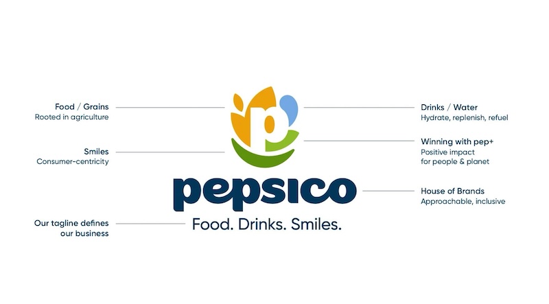
    NEW YORK: PepsiCo has binned the branding it has worn for a quarter-century. Out with the old, in with the grin. The company’s fresh corporate identity, unveiled on 28 October, marks its biggest visual shake-up since the turn of the millennium—a deliberate signal that this is no longer just the fizzy-drinks firm your parents knew.

    Sixty years after Pepsi merged with Lay’s, the empire has swelled to more than 500 brands—Tostitos, Gatorade, Quaker, Siete, poppi—and 300,000 employees. It peddles snacks and beverages from Kansas corner shops to Cairo kitchens, from São Paulo’s streets to Shanghai’s stores. Yet only 21 per cent of consumers can name a PepsiCo brand beyond Pepsi itself. Chairman and chief executive Ramon Laguarta reckons the rebrand will fix that. “Our new identity boldly reflects who we are in 2025: a company with expansive reach, aiming for positive impact across the globe,” he says.

    The new logo plants a “P” at its centre, hemmed in by shapes representing consumer focus, sustainability and taste. A custom typeface in lower case softens the corporate edge. The colour palette draws from earth tones and vivid hues—soil, drinks, planet, people. And lurking beneath it all: a smile. That grin anchors the company’s new three-word mantra: “Food. Drinks. Smiles.”

    Chief consumer and marketing officer and chief growth officer for international foods  Jane Wakely calls it “a beautiful expression of both who we are as a company today and our aspiration for the future.” The smile, she insists, signals an “obsession with consumers” that will fuel growth.

    The rebrand will roll out gradually across PepsiCo.com, LinkedIn, Instagram, YouTube and TikTok, then seep into packaging, workplaces and signage worldwide. Whether it prompts consumers to smile back—or simply reach for a rival’s crisps—remains to be seen.

  • Truecaller empowers users with new ‘True’ identity

    Truecaller empowers users with new ‘True’ identity

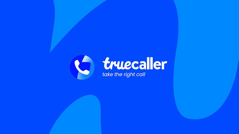
    Mumbai: Truecaller, the world’s global communications platform unveils its new corporate brand identity with a redesigned brand logo and app icon. The new look and feel of the brand with a refreshed app icon reflects the essence of the Truecaller brand, making it much more distinctive which will be instantly recognizable anywhere. Interbrand, the world’s leading brand consultancy and Truecaller have conceptualised this together to create a governing idea and key insight that addresses people’s desire for clarity, confidence, freedom, and fulfilment.

    The new brand identity is created with an intent to serve as an enabler and help drive a change for the users who are prone to vulnerabilities and increasing scams in the digital space. The tone of voice and colors of the redesign reflect the personality of the brand – trustworthy, straightforward and approachable as we strive to put the power back into the hands of the people to have more control over their life with safe communication.

    “Today when brands are going out of their way to find their ‘purpose’, we don’t take lightly that we have purpose built into the core of our business. When we empower our users to take the right call, they in turn empower millions more by marking out fraud and spam calls. This flywheel of trust, powered by our 356-million strong global community, helps make communication a little safer every day. Our new positioning and brand identity is a reflection of this empowerment and trust.” said Truecaller VP global brand Ashwani Sinha.

    Talking about the new identity, Interbrand India & South Asia CEO Ashish Mishra said “Brands are increasingly being built on new acts of leadership. In areas which concern the world and its people most. We found an opportunity in the pervasive disinformation that plagues our times. Truecaller perhaps is the best placed brand in the world to lead the empowerment of people, businesses, and communities through true information. Under this larger ambit of nobility laced with a touch of activism, lie the more tangible step ups of recognizability and smooth experience. A signature design system and UX audit to identify the experience gaps helped deliver these within the rebrand.”


  • “We aim to sell close to one lac EVs, this financial year”: TPEML’s Vivek Srivatsa

    “We aim to sell close to one lac EVs, this financial year”: TPEML’s Vivek Srivatsa

    Mumbai: Incorporated on 21 December 2021, Tata Passenger Electric Mobility, a subsidiary of Tata Motors, has unveiled its new brand identity, TATA.ev, marking a pivotal step in India’s EV revolution. Aligned with sustainability and innovation, the identity embodies “Move with Meaning,” uniting values of sustainability, community, and technology. The Orbit logo and Evo Teal color symbolise a circular ecosystem and tech-forward commitment. This evolution reflects Tata’s drive toward a greener future while emphasising customer experiences. With a 70 per cent market share in four-wheeler EVs, Tata’s pioneering journey includes selling over one lakh EVs, showcasing a commitment to sustainable mobility.

    Indiantelevision.com on the sidelines of the press conference, caught up with Tata Passenger Electric Mobility Ltd (TPEML) head, marketing, sales and service strategy Vivek Srivatsa to talk about the idea behind the EV business, their TG, market share, etc.

    Edited Excerpts:

    On Tata Motors being the first auto manufacturer to launch an EV in India

    Yes, the first mainstream EV cars with the Nexon EV in 2020. When I say mainstream, it means you can use it like any normal car, i.e., it comes with the right warranty, safety, and all that. We launched the Nexon, the Tigor and the Tiago which was showcased last year in the IPL.

    On TPEML’s market share and the idea behind getting into the EV business when India had not yet opened up to the business

    We saw the signs early. A large part of Western Europe was adopting to EVs and India’s government was strongly pushing EVs and on the kind of subsidies being offered for both manufacturing as well as for customers in terms of GST reduction, made it a very compelling business case, as well as a use case for customers. Of course, it involves some capital investment and some R&D, but we thought we should do it for the betterment of the country in terms of moving towards more sustainable mobility sources.

    But also, when we saw internally in Tata Group, we had all the ingredients ready to move into this, which probably other companies did not have. We had Tata Power, we had Top Auto Components who make the batteries for us. We have obviously Tata Motors expertise in making cars. We have TCS who make software. So, we have all the basic requirements already in place, we just have to create the ecosystem together and take advantage of the government’s subsidies and incentives to give a viable product.

    On the buying trends of Indians today and are you urban-centric or reaching out to your TG’s in the tier-2 and tier-3 market

    Electric vehicle (EV) adoption is surging robustly. The initial 10,000 sales spanned 44 months, while the subsequent 40,000 were achieved in just 15 months. The next 50,000 sales took only nine months. This strong acceleration indicates that achieving the next milestone of 100,000 sales might take 12 months.

    When we launched Tiago, more than 25 per cent of our sales came from the smaller towns. Smaller towns have an inherent advantage in that there is no restriction on parking space. Requiring parking space for charger installation poses a challenge in urban areas, while smaller towns face no such issue. Two-wheeler EVs are already hugely used in smaller towns. So as a concept, it’s not alien to them. They are very focused on the cost of operation. EV is one-eighth or one-tenth the cost of operation of traditional cars and the distances they travel also is not too high. So, EV use case for smaller towns is actually perfect and we are seeing very fast adoption there.

    On Tata Motors building up sustainability, educating your consumers and carrying it forward in various activities in CSR and other things

    Firstly, at the Tata Group level, there is a group-level commitment under something called ‘Project Aalingan’ towards sustainability. Tata Motors is the same, we have committed to be carbon neutral by 2040 which is the most ambitious target for an Indian automotive company. We have committed to be water neutral by 2030. So, firm commitments have been made and that is internal. Through EV adoption and the work with our customers, we are pushing sustainability into the lifestyle of our consumers as well.

    First is obviously, by using EV itself, we’re saving carbon emissions, but we’re taking it beyond with the new brand design and the practices to follow for our community will teach them other elements of the community in terms of long use items, i.e., the longer you use anything, the better it is for the environment, whether it is clothes, gadget or anything. Safe disposal is very important. CSR activities, like educating the underprivileged, and clothes donation for the underprivileged, among others are the ones we are going to formally pursue. These are anyway strong active pillars of what Tata Group does. So, it is actually an extension in a modern way. Not only are we focused on sustainability at a Tata Motors level, but we are also focused on the CSR activity, which actually is a parallel line to sustainability.

    On conceiving the campaign film and its conceptualisation

    The new brand design has been conceived by our partners, Landor & Fitch. They helped us lay this out. There were a few challenges because there are so many aspects. On the business side, it’s a growing business is a very demanding consumer. On the sustainability side, we have made firm commitments and we needed to showcase that also. Also, it has to be a brand design, which is able to be present across all our touchpoints, i.e., digital, retail, communicating offline, online, and digital. So, it took about a year for us to put this together. I think it will help us give a firm direction to, whatever we do in the future.

    On the significance of the bridge

    So, the bridge brings humanity to whatever we do. It allows us to express ourselves better. You can treat it like a floating underline. It allows us to express things better. It’ll also be immediately recognisable as a TATA.ev communication. It does bring in a certain level of expressiveness without

    costing too much and not being on your face.

    On their future plans and the EV’s price range

    We aim to sell close to one lac EVs, this financial year. What we have committed is, we want to look at about 50 per cent of our portfolio or sales being on the electric side by 2030.

    Our EV’s range starts from just below 10 lakhs and goes up to 22 lakhs right now.

  • Spartan Poker unveils its new brand identity

    Spartan Poker unveils its new brand identity

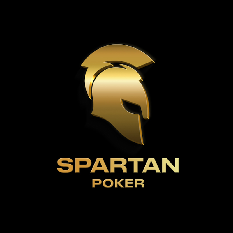
    NEW DELHI: Digital gaming platform, Spartan Poker, has unveiled its new brand identity with a redesigned logo and a tagline. ‘Straight Up Skill’, the new visual identity is designed to represent Spartan Poker as a platform that encourages skill as the biggest equaliser in the game of poker.

    The new brand visual identity includes a Golden Spartan Helmet mask that is a nod to Spartan Poker’s community and has played a big role in the company’s ongoing success. The new, bold and vibrant logo in Golden colour embodies the characteristics of the intellectual and skilled player, the press statement added.     

    Speaking on the refreshed identity Spartan Poker founder and MD Amin Rozani said, “The rebranding is an exciting change for Spartan Poker. This initiative will convey the continuing evolution and philosophy of the brand, and proudly highlight the approach we want to communicate about the brand.” 

     On the rebranding, Blink Digital co-founder Rikki Aggarwal founder, “We started with primary research to gauge audience sentiment. Based on our analysis, we redefined every facet of the Spartan core identity, creating a framework for a distinct visual and verbal manifestation. Finally, seeing the rise of online gaming globally, we rose to the occasion to elevate the experience for customers in a bold and contemporary way, reinforcing their belief in skill as the ultimate equaliser in poker and in society. Think: #StraightUpSkill in straight-up style.”