MUMBAI: The adland gods are assembling—and they’ve got a brief to judge. The Advertising Club has unveiled a glittering lineup of jury chairs for the Abby Awards 2025 powered by One Show, naming four creative titans to lead key categories ahead of India’s most anticipated industry celebration at Goafest this May.
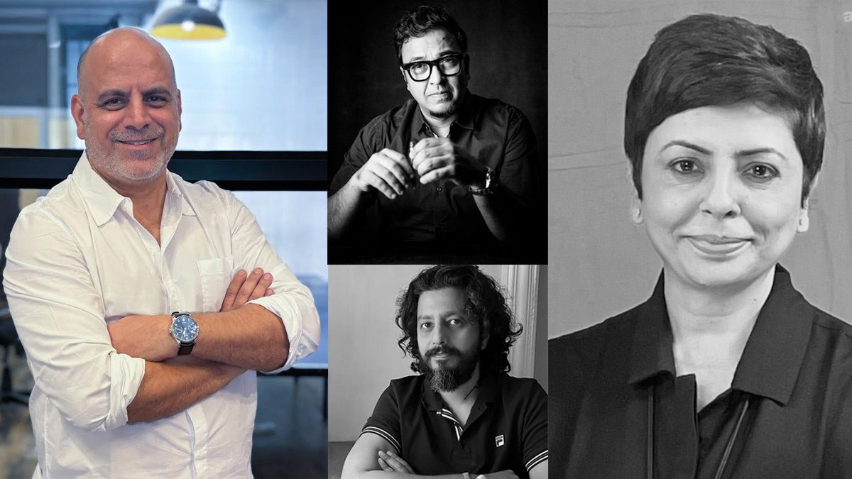
The new jury cohort includes Ashwini Deshpande, Ashish Chakravarty, Raj Kamble, and Ashish Khazanchi—each a bonafide heavyweight with enough trophies to sink a conference table.
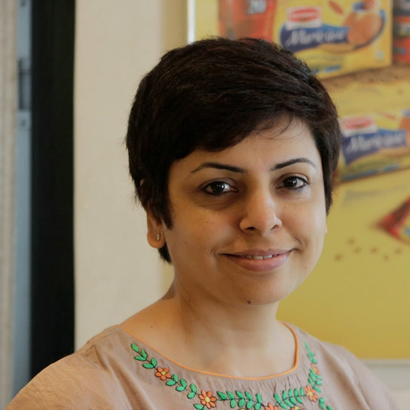
Elephant co-founder & director Deshpande takes charge of the design category. A pioneering force in India’s design scene, Deshpande has spent 35 years building one of the country’s most respected independent design consultancies. With a résumé thicker than a Pantone swatch book, she’s judged Cannes Lions, The One Show, Spikes Asia, and LIA, among others. She currently serves on the jury for Singapore Good Design Awards 2025 and mentors start-ups via TiE.
McCann Worldgroup executive director & India head of creative Chakravarty will lead the Audio jury. The man’s got over 500 awards under his belt—One Show, Cannes, Clio, D&AD, you name it—and has chaired or served on nearly every awards jury worth attending. Known for blending big ideas with brand precision, Chakravarty brings sonic sensibilities and sharp storytelling instincts to the panel.
Out of home and ambient? That’s Kamble’s turf. Famous Innovations founder & CCO has made a career out of smashing boundaries—from Lowe London to BBDO New York to founding one of India’s most disruptive independent agencies. His awards shelf holds over 150 trophies including Cannes and One Show golds, and his agency has bagged South Asia Independent Agency of the Year nine times in a row. Now that’s a media buy with ROI.
Enormous Brands managing partner & CCO Khazanchi takes charge of the Direct category. He’s the brain behind iconic brand launches like Tata Sky’s Jingalala and Lenskart’s first major campaigns, with over 300 national and 50 international awards to his name. Known for his sharp eye on consumer insight and startup flair, Khazanchi is no stranger to turning simple ideas into scaleable results.
The Abby Awards 2025 powered by One Show will take place on 21–23 May at the Taj Cidade de Goa Heritage and Horizon, as part of Goafest 2025—jointly hosted by the Advertising Agencies Association of India and The Advertising Club.
NEW DELHI: A little more than two years after the Vodafone and Idea merger on 31 August 2018, the brand finally announced a new integrated brand identity for itself on Monday noon. The new brand named ‘Vi’ comes with the promise of “Together For Tomorrow”, ensuring users that the company will play a bigger role in the consumer journeys. In the press interaction, the senior management also indicated that the merger will move ahead with a sharp focus on augmenting digital experiences for the user.
The branding exercise has attracted a lot of attention within the industry and started many discussions across platforms.
Sideways co-founder Abhijit Avasthi pointed out that there was great anticipation surrounding the new brand identity when two of the biggest telecom companies in India merged two years back and this new entity is signalling the beginning of a new journey for them as an integrated entity. It’s a launch of ethos and a new persona.
“I am keen to see how the new company will behave going forward as in their initial avatars, the two were very different companies; one was far modern, contemporary, young and the other one was a little bit more earthy.
Abhijit Avasthi
AVASTHI THINKS IT IS A LAUNCH OF A ETHOS
AND A NEW PERSONA
Almond Branding founder & director Shashwat Das said, “If I come down to the logo for what is the largest telecom integration in the world, I am a tad disappointed. While there has been an attempt to retain the equity of both Vodafone and Idea logos- the red colour and the exclamation respectively, the end outcome could have been a lot more exciting.”The new elements of the brand identity, the logo, the moving lines of the animation, and the bold mustard dot of I, has initiated a series of discussions on various media. But the industry is not mighty impressed with the new design.
He added, “I have already seen people mistaking it for the Roman numeral six and am sure that the circular dot jutting out at the bottom will be making a lot of people uncomfortable. To some it looked like a medal. But I am also a bit concerned about the uncanny chiseling of the V at the base. The way I decode it, the bold mustard dot will be a dynamic element of the identity showcasing the amazing possibilities and also symbolizing focus – bringing back the focus on the consumer. So while the concept is good, the execution leaves us wanting for more.”
Shashwat Das
DAS IS DISAPPOINTED WITH THE NEW LOGO
Elephant co-founder, director Ashwini Deshpande said that it is a bit premature to respond to a logo when one hasn't seen the visual language or communication around it but it doesn’t look like a mobile first logo that the company might want it to be. She quipped that the finesse that Vodafone was famous for, in its language and script, is missing in the new brand identity.
“In the absence of a full picture, it reminds one of solid logos from the industrial era except the falling yellow penny that is out of scheme for those times. It doesn't look like a 'mobile first' logo. Also wondering how the app icon will pan out since the yellow penny will reduce the size of V & I in the app icon enclosure. Considering the exposure & choices of Gen Z & millennials, it is a bit disappointing. It neither conveys communication nor technology,” she elaborated.
Ashwini Deshpande
DESHPANDE IS ALSO DISAPPOINTED AS THE NEW LOGO
NEITHER CONVEYS COMMUNICATION NOR TECHNOLOGY
Deshpande further commented, “This would have been the perfect time to liberate the visual identity from the regimented colour scheme borrowed from previous identities of Vodafone and Idea. But the design has stuck to predictable red & yellow. Looking at how the Jio logo has several colour versions (even Docomo did this earlier and Go Air too) that still look ownable due to the font and container, V! (Vi) seems to have passed that opportunity.”
Das disagreed a little from Deshpande as he pointed out, “The digital-age modern identities have to be dynamic, flexible and fluid. I am sure that the new Vi identity will live upto it. I visited the new website and it did look fresh and elegant. The design is indeed minimalistic and the identity is fluid enough to transform itself into various forms and environments. The mustard dot can be seen everywhere from radio-buttons to the chatbot animations. So I believe the dynamism and fresh look can help hook the attention of the young consumers.”
He added, “I also like the tagline “Together for Tomorrow” which captures both the aspects of the two companies coming together for a brighter tomorrow as well as WE (the company and the consumer) are in this together to build a better tomorrow. There is a lot of power in the inclusiveness and collaborative feel of Vi (read We). Hence the brand storyline has immense potential.”
MUMBAI: Footwear major Relaxo has undertaken a rebranding exercise mandating Elephant Designs with the job.
Explaining the reasons behind the rebranding intent of the 40-odd-year-old brand, Relaxo Footwear executive director Gaurav Dua said that it was their responsibility to build a future-ready brand. They were an ever-evolving brand that stayed true to the core values of being reliable.
With the rebranding exercise, they infused youthful and transformational spirit that was important for the growth of internal and external stakeholders of the brand. Elephant, the brand building partners, played a significant role by understanding the brand’s value proposition, Dua added.
Elephant co-founder & director Ashwini Deshpande said that Relaxo rebranding exercise involved validation of current values of being approachable while seeking newer dimensions to reiterate the brand’s leadership. Elephant built the new Relaxo visual identity with a wave of positive transformation. Brand’s dynamism was embodied by forward slanting letters in Berry Blue with Sunny Yellow swoosh flowing across.
The swoosh stands for wave of transformation, optimism and positive growth. All brand applications were being created with an ownable visual language and would be evident soon, she added.
MUMBAI: Like the two sides of a coin, India too is divided into two mindsets. While a certain part is moving towards modernisation, there are still a few things that are holding us back to be culturally liberal.
P&G Whisper’s new advertising campaign brings out the painful truth of our society.
According to market experts, the Rs 2,100 crore sanitary napkin market in India is growing at the rate of 19 per cent year on year. Whisper is one of the dominating brands in the category that has worked smartly on its pricing strategy over the years.
The brand, in the past, has taken up various corporate social responsibilities (CSR) as part of its marketing initiatives.
It can be recalled that P&G’s ‘Parivartan’ program has been protecting millions of adolescent girls in India from getting trapped in traditional practices of using unhygienic cloth for sanitary protection by providing menstrual education.
The program has been improving the lives of over two million girls annually across 15,000 schools in India. The objective of the program is to help adolescent girls embrace womanhood positively and enable them to adopt the right feminine hygiene practices to stay healthy and stay in school. ‘Parivartan’ ensures that adolescent girls do not miss school on account of periods and initiates a series of cascading effects leading to a more equal gender status in the state.
P&G’s ‘Shiksha’ that was launched in 2005 was aimed at enabling consumers to contribute towards the cause of education of under-privileged children through simple brand choices. It is considered to be one of the most successful CSR campaigns initiated by a multinational corporation in India.
Taking a step further and breaking the stereotypical communication thoughts, Whisper has rolled out a movement titled #TouchThePickle to try and put an end to period taboos that still haunt many Indian girls and women. The movement is initiated under the brand campaign called ‘Kadam Badhaye Ja’.
The TVC already has got over 22,600 views in five days. The video which was shared on the brand’s You Go Girl page has received over 17, 908 likes and 494 shares.
On the communication strategy by the brand, the Elephant Strategy+Design founder director and principal designer Ashwini Deshpande wished the TVC was done 25 years ago, but feels it is never too late.
“A global brand with real alignment to Indian culture is a rare sight yet delightful,” adds Desphande.
On the other hand Curry Nation co-founder Priti Nair has a different observation. “When I first heard about the movement I really thought that is a fantastic concept, very radical and memorable. I was genuinely happy and proud that a brand like Whisper has taken this stance. I thought we are finally getting rid of the stereotypical commercials from this category and someone is busting the conservative regressive cultural myths attached to a natural cycle of a woman and wished I could have done something similar. My perception changed after I saw the ad,” says Nair.
She believes that the brand diluted the huge idea to tick all the points of research work. According to her, the brand should have taken on the regressive thoughts on menstrual cycle and break them first and then taken on more myths that exist in our society.
“A brand like Whisper which worldwide is doing large mind set alteration would have succeeded doing that in India as well,” concludes Nair.
MUMBAI: Elephant Design has conceptualised and designed the new brand identities and packaging of Britannia‘s Tiger Glucose and Cream biscuits.
Elephant founder director Ashwini Deshpande said, “When redesigning a large popular brand like Tiger, one has to layer the packaging communication in a way that announces the new story delightfully, and yet does not alienate existing consumers.”
Britannia said for a brighter and smarter appeal, Tiger palette has been kept red, blue and white. The product‘s promise of 25 per cent daily growth nutrients was picked up and amplified on the pack through a mnemonic that was supported by RTBs of Iron, Calcium, Folic Acid and Vitamin A & D.
The brand identity has been revamped to give a cleaner look with 3D white letters encased in blue.
Elephant principal of packaging design Mayuri Nikumbh said, “We tried to probe what mothers look for when they are making important everyday decisions towards growth of their children. Our insight led us to communicate the fact that a simple Glucose biscuit could actually play such a positive role in growth and with proper choice, one could derive significant benefit for a growing child.”
Britannia category director (health and wellness) Anuradha Narasimhan said, “It was a challenging brief that we gave our design agency. To bring in credentials and nutrition to a brand design that used to stand for fun and energy, while maintaining continuity and recognition. I am delighted that Elephant Design brought in the growth story with the right confidence and credentials and managed to carry it through the entire portfolio of Tiger Glucose, Krunch and Creams. I am sure the brand will come together and stand out in a crowded retail space”.
Britannia has partnered with Elephant since 2006 as its primary packaging design agency for brands like NutriChoice, Marie Gold, Treat, Tiger, Bourbon, Pure Magic, 50-50, TimePass, breads, cakes dahi and flavored yogurt.
MUMBAI: Strategic Design outfit Elephant has elevated Ravi Kabara as president effective August as the agency aims to strengthen its professional and operational practices. Prior to his elevation, Kabara was the vice-president, business and programme development.
Kabara has been with Elephant since 2008 when he looked after business development. He has more than 17 years of experience across marketing, brand management, business development and design. Before joining Elephant, Kabara was at Bajaj Auto across handling functions across sales and marketing for 13 years before his stint at Elephant.
Kabara said, “My aim is to achieve higher levels of growth from meaningful work. I will focus on expanding the reach of Elephant brand and augment the contribution of strategic design across clients‘ business needs. I will also ensure that quality of delivery, teams and operations remain excellent.”
Elephant founder-director Ashwini Deshpande said, “Ravi brought a good balance of professionalism and business understanding at Elephant without affecting the intrinsic passion and free thinking that this profession requires. It seemed like the right time to entrust him with greater responsibility that would leave the founders with more time to mentor teams and explore newer ways of achieving innovation.”
Elephant has a portfolio of brands and projects across sectors and clients including ABD, Abbott, Akzo Nobel, Axis Bank, Bausch + Lomb, Britannia, Comviva, Daimler India, Delhi Duty Free, Godrej, Godfrey Philips, Heinz, HUL, Mars, MTR, Nirlep, P&G, Piramal, Sakaal, TalentEdge, Venky‘s and Wipro.