MUMBAI: Fishing for change just got literal. India’s seafood brand known for its wild-caught, chemical-free offerings, Dam Good Fish has cast its net wide with a bold new brand identity. The overhaul, revealed on 17 June 2025, signals a deeper commitment to sustainability, conscious consumption, and a seafood-first philosophy that’s as clean as the fish it sells.
This isn’t just a shiny new logo and colour palette. The rebrand includes a redesigned website, sharper product storytelling, and visual elements that represent the brand’s core values: no shortcuts, no toxins, and no industrial farming.
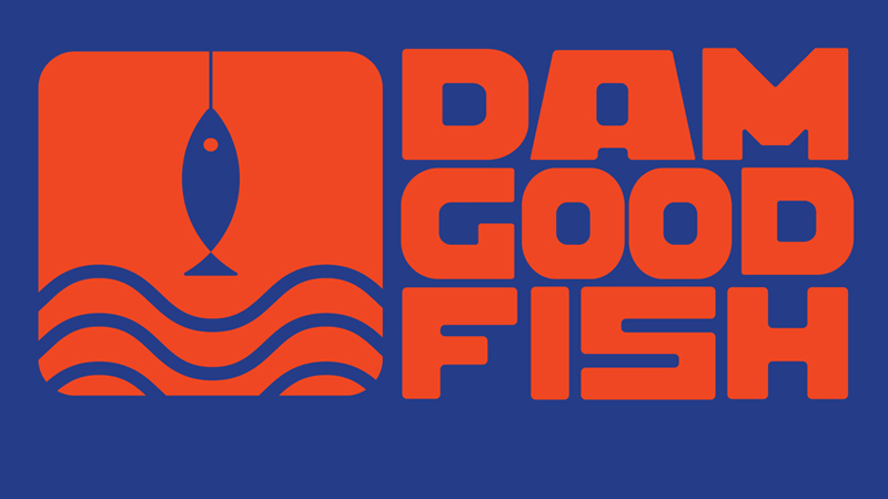
The logo itself is layered with meaning. The Waves stand for the brand’s wild-caught origins—far removed from antibiotic-fed aquaculture. The Fish icon symbolises singular focus, as Dam Good Fish stays loyal to its core: high-quality, no-compromise seafood. The Hook pays homage to traditional, ethical fishing methods in a world increasingly overrun by mass-produced protein.
“This rebranding is more than just a new look — it’s an evolution of our purpose. We’re making conscious seafood consumption a mainstream choice, by making it easy, exciting, and accessible”, said Dam Good Fish co-founder Shailesh Patel.
The brand has also dialled up its colour story. The Red in the logo captures the warmth and freshness of fish meat. The Blue evokes pristine water, the only kind Dam Good Fish claims its produce comes from. Together, they reflect a supply chain that is cold-chain verified, free of growth hormones, artificial feeds, or antibiotics.
With its philosophy of ‘good for you, good for the planet’, Dam Good Fish continues to position itself as the go-to for sustainable, responsibly sourced seafood in India. This rebrand isn’t just surface-level—it aims to turn clean seafood from a niche habit into a national movement.
Leave a Reply